UI design is already a competitive niche. So if you’re an aspiring UI designer, you won’t get anywhere until & unless you set your approach right- knowledge of its principles & formats, what all are the tools that you can go for, what’s trending in UI, and what’s its future.
Good thing that I’m going to cover all these things in this article & much more so you can set yourself on the right path as a UI design beginner. So without any delay, let’s cover the critical topics one by one.
What is UI design?
By its very name, User Interface (UI) suggests the interface a user sees and interacts with. Thus, UI designing is a process of creating apps & website interfaces, and the role of a UI designer is to design these interfaces.
UI design is solely based on 3 important basics. A design based on these basics will likely attract users to interact with.
These 3 elements are:
Look, i.e. the visual elements on a screen
Style, i.e. transitions between different screens
Interactivity, i.e. the interactive properties to facilitate user interaction
For example, let’s take Instagram; when you first used the application, it’s not like it took you hours to figure out how to use it. That’s because each transition, icon, and element make sense on its own and are easily understandable.

Woman successfully transferred money online via electronic internet banking application on smartphone – financial technology or fintech concept
What is the difference between UI & UX?
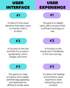
Though both the terms – UI & UX designs – are used interchangeably, they are more or less the two opposite sides of the same coin.
In simple terms, UX designers draw the layout of the products, which UI designers then bring into reality with visual and interactive touchpoints.
Also, a UX designer works towards enhancing user satisfaction through the usability and accessibility of a product. At the same time, a UI designer enhances the user’s satisfaction by making the product’s interface look and feel enjoyable for the user.
But, it doesn’t matter how different their roles are; UI & UX designers often work in tandem to improve & maximize the responsiveness, efficiency, and accessibility of a website/app.
Thumb Rules of UI design
While many experts give many rules, it’s very tough to cover them here. Adobe has described 4 golden rules of UI design in an article. Let’s explore them one by one.
Place users in control of the interface
One of the characteristics of a good UI is it instills a sense of confidence in the user to make them feel comfortable and learn quickly. Here are the ways you can do that too:
- Make actions reversible to allow users to explore the product without the constant fear of getting stuck to a point and do it all over again.
The most common example of this type of GUI (Graphic User Interface) is the ‘Undo/Redo’ option in text and graphics editors.
While ‘Undo’ helps reverse the actions taken step-by-step, ‘Redo’ lets users undo the undo.
- Create an easy-to-navigate interface by creating a clear and self-evident navigation route. It puts users in their comfort zone by giving them an idea of where they are, where they’ve been, and where they can go next.
The two easy ways with which you can create easily navigating interfaces are:
- Providing visual cues to provide users a reference as they move through a product interface. For example, page titles, highlights for the currently selected navigation option, etc.
- Predictability with the help of cues that help them predict the result of an action.
- Provide informative feedback to acknowledge the users’ actions. The response can be modest for frequent actions. However, for infrequent and significant actions, it’d be great if the response should be more substantial.For example, the Thank You page that appears once a user successfully makes a payment for an order is a modest response for a frequent action.
On the other hand, the error message you get when you’re filling out a password section in the signup form saying it doesn’t meet the requirements is a type of substantial response for significant actions.
- Show the visibility of system status to give users information about what is going on and provide them periodic feedback about the status of the process. It becomes critical where users initiate an action that takes some time for a computer to complete.
A good UI uses progress indicators while the system is completing a process to comfort users.
For example, in the below screenshot, Dropbox indicates the status of a document upload: the current progress and the amount of time left.
- Make it accessible to users with different skills, so you stay relevant to the entire audience. Sacrificing expert users and designing an easy-to-use interface for a novice or casual user is not a great idea and vice-versa.
For example, you can add features like tutorials and explanations to help novice users and an option to “skip” for experienced users.
Make the interaction super-easy for the user
- Follow a ‘Less is more approach to simplify interfaces by eliminating all elements that are not helping your users. It allows relevant information to reach the users.
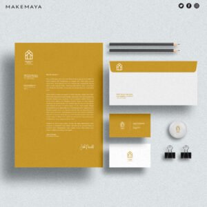
- Don’t ask for repeated information. Remember, a good UI gives a maximum output while requiring minimum input from users.
- Avoid using jargon, and use language that is easy to read and understand instead.
- Applying Fitts’ law to interactive elements. Fitts’ law states that the time required for a person to move a pointer (e.g., mouse cursor) to a target area (CTA or other fields) is a function of the distance to the said target and the size of the said target. So, try to reduce not only distances but also increase target sizes.
- Design interfaces accessible to all, including those with low vision, cognitive impairments, blindness, motor impairments, or hearing impairments.
- For example, approximately 10 percent of men and only one percent of women have color blindness. So, anytime you want to use colors to convey some information, you should also provide cues to some who don’t see colors.
- Use real-world metaphors for users to transfer their existing knowledge to grasp the finest details of the conceptual model.
- For example, the Recycle bin on your desktop is self-evident as to what it is used for.<Image>
- Turn errors into a conversation to prevent users from getting frustrated and leave your app/website.
- Give hints to solve the problem, for example, the error message you get on your Gmail once you forget your password.

- Prevent the problem from occurring, for example, the notification you get once you enter the Gmail address of someone outside of your organization.

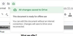
- Protect user’s work irrespective of an error on their side (i.e., refreshing a web page accidentally), a system error, problems with an internet connection, Or any other reason.
- For example, Google docs save your progress in real-time and also gives you an option to edit offline.
- Chunking for sequences of information or actions says that human working memory can handle seven-plus-or-minus two “chunks” of information while we’re processing information.
- So, if your UI asks the users to fill in their contact numbers without normal spacing, it can result in many incorrectly-captured phone numbers.

- Reduce the number of steps required to complete a task. Users tend to get frustrated when it takes repeated clicks to get to the information.
- Promote recognition over recall as it involves more cues that help us remember information.
- A UI that makes information and functionality visible and easily accessible promotes recognition and is a sign of a good UI design.
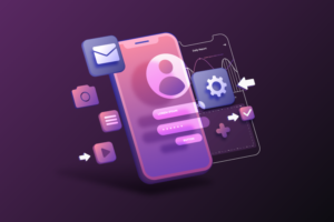
- Promote visual clarity by:
- Keeping the information minimal & relevant to the purpose of the page on the screen.
- Apply principles such as grouping similar items together, numbering items, and using headings and prompt text.
Consistent User Interfaces
Consistent design is intuitive design, i.e., it promotes usability and learnability among users. It allows users to transfer their knowledge and skills from one part of an app’s/website’s UI to another and from one app/website to another app/website.
- Visual consistency (Style). Using the same colors, fonts, and icons throughout the product prevents users from questioning the integrity of a product.
For example, a Submit button on one page of your site can’t look different from the other page on any other page.
- Functional consistency (Behavior). Keep actions consistent by following “The principle of least surprise,” The key here is that the behavior of interface controls, such as buttons and menu items, should not change within a product.
- Consistent with user expectations. You need to understand that people already have certain set expectations about the apps/websites they use.
- Consistent with platform guidelines to let your users understand individual interface elements in your design.
- Don’t reinvent patterns and use popular patterns as the majority of users are familiar with them.
- Don’t reinvent terminology and use words that are standard in the said niche.
UI Design Tools
Along with the UI landscape, its tools have also evolved so much. From simple, early whiteboard exercises to work on the finish, there’s a whole set of tools available for each & every step of UI designing.
Being an aspiring web/app UI designer, you need UI design tools for the following things:
- User testing
- Wireframing
- Prototyping
- Visual design
- Optimization
- Handoff
So, what are the best UI design tools among them? Well, through our own experience & some market research, we’re presenting you 10 UI Design Tools that the majority of designers use.
- Sketch
- Adobe XD
- Balsamiq
- Figma
- InVision Studio
- Marvel
- Axure
- Framer X
- FlowMapp
- Origami Studio
- Proto.io
Sketch
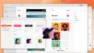
Starting out as a visual tool for web-based products, Sketch has come a long way and stands as one of the most popular design tools around.
So, why is Sketch so revered?
Because of its intuitive interface, it can make universal changes. Layer styles, text styles, smooth resizing and alignment features, or symbol- you name it, and the chances are that Sketch has it.
It lets designers save time on tedious tasks and unleash their creativity to its full extent.
Please note that Sketch is only available on iOS platforms as of now.
Adobe XD
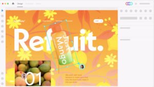
XD is Adobe’s UI design software that offers vector-based user interface tools to create fully-fledged prototypes- including workflows, element creation, animated transitions, other dynamic elements- and mockups (apps & websites).
Its ability to bring different disciplines together without any lack makes it one of the rare design platforms out there. One more benefit of using Adobe XD is that, like every other Adobe tool, it combines perfectly well with each other.
Balsamiq
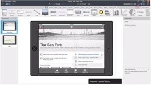
If you have just started or are about to start your UI designing journey, Balsamiq should be your go-to tool for creating low-fidelity wireframes.
It helps you create mockups quickly while providing designers with enough icons and tools to focus on ideas without worrying about the design.
Figma
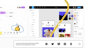
Figma is a cloud-based designing tool that lets designers build dynamic prototypes and mockups, test them for usability, and sync up all of the progress.
But the reason it is preferred over other tools is that it allows for real-time collaboration, i.e., multiple people can work on a project simultaneously, much like Google Docs.
You can not not only see who’s working but can also see what they’re doing.
Also, it is a browser-based tool that makes it accessible to everyone in an instant.
Furthermore, Figma integrates smoothly with tools like Maze, Zeplin, and Confluence. It makes it a great go-to option for everything design-related.
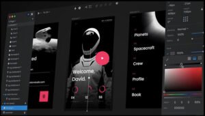
InVision Studio
From outlining the user journey to collaborating on early design, to wireframes and prototypes, and finally, to its design handoff features, InVision gives designers a wide array of UI design tools to create fully realized and functional mockups consisting of dynamic elements and animations.
On top of these easy-to-use UI design tools, it also makes communication easy among the partners — collaboration features that allow sharing the work as it’s designed, receiving feedback, and making documented changes at each step.
Marvel
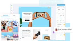
Even if you’re a seasoned designer or a newbie to UI design, Marvel’s design platform is excellent for everyone.
Low fidelity and hi-fi wireframes, generating interactive & functioning prototypes (implement gestures, import designs, add screen elements, and do everything else), and user testing- I mean, what more a UI designer can ask for.
Also, one of its features, called Handoff, gives developers all the CSS styles and HTML code they require to start designing.
Axure
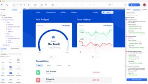
Prototyping and keeping track of the workflow are two main functions of the Axure. It allows designers to create wireframes and lo-fi prototypes that are easy to use but, at the same time, without compromising on function.
With the data-driven interactions, it enables designers to quickly create prototypes without any coding.
Dynamic panels, animations, and graphic interactions- Axure makes features set up a super-easy task that is otherwise a time-taking process.
Also, its collaboration feature allows multiple designers to work on a single project file simultaneously.
Framer
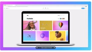
Though Framer (formerly known as Framer X) requires a basic level knowledge of CSS and HTML code for aspects like interactions and animations, it comes with many features.
High fidelity prototyping that results in prototypes full of details and real-time changes for smoother communication makes Framer an ideal choice of the UI designers.
It is also developing tools for wireframing and visual design.
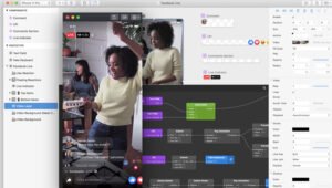
Origami Studio
Originally built to be used by Facebook’s designer, Origami Studio is now available for free to everyone.
It enables designers to create more hi-fi prototypes. However, it’s a more complex prototyping tool than the majority of tools on the list.
With its patch editor and a well-stocked library of existing patches, you can build the logic behind prototypes. The focus on individual pages allows users to depict precisely how the individual page is intended to work.
Proto.io
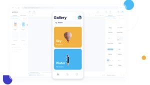
In the words of Proto.io itself, they aim to create “Prototypes that feel real.” And they do it brilliantly by enabling users to create, organize, integrate, and test hi-fi prototypes.
Proto also facilitates a smooth collaboration process by fostering communication between the project members through comments and video feedback, as well as integrating with some of the more well-known testing products, like Lookback, Userlytics, and Validately.
How do I become a UI Designer with no experience?
It’s really hard to become a UI designer without a portfolio.
First and foremost, try to build your portfolio by working on Freelancing works. You can easily find many jobs opportunities across freelancing websites.
There are majorly 3 types of works you can add to your portfolio.
Redesigning the existing apps/websites and give them a new look.
Design apps by your own with some new concepts. Involve in Volunteer designing works.
UI design- Current landscape & future
Current Scope of UI Design
Now that you have the details, your next obvious question would be—What’s the scope of UI design currently? So without wasting any more time, let’s see how the UI design landscape looks in India currently.
Deemed as one of the most lucrative career options, UI design is rapidly gaining its footing among youths.
Its popularity can be estimated from the fact that there were 18,052 UI design openings in India on Naukri.com alone while we were writing this piece.
Also, when checked on Glassdoor, the average base pay for a UI designer in India is ₹5 Lac per annum which is quite a handsome pay according to the Indian market.
Future of UI Design
UI design is significant at present, but in the future, it will play a very crucial role in shaping our world, our lives, and even our daily habits.
The development of AR & VR and platforms based on these technologies like metaverse will change how we communicate, shop, interact, and much more.
We took the opportunity to connect with various UI experts and ask for their opinion on the future of UI. Here are what the experts think UI would be like in the coming years.
<Name> believes that Dynamic UI would rule 2022 and he presented a very good argument for it. Let’s see what he said to us.
Globally, the number of mobile users exceeds web users by all means. That’s not surprising for leading tech products to put their focus on their users’ satisfaction.
In this example, we can see Instagram running navigation A/B Testing & we know that usually, people use gestures to access these pages. If we look deeper into the cause of this testing we can see that Instagram is checking the usage of DMs vs Profile.
In my opinion, 2022 will be the year of Dynamic UI, apps will change the way they look according to the user’s need. For example, if Instagram is being used for business, swipe left will open the inbox vs if it is for regular users swipe left will open the profile. So I think gestures will be customized according to the user’s needs.
So that’s what Robert Sfeir thinks for 2022. However, another expert, Atul Pal, has a different opinion on that.
As we all know, every year there is a new design trend. So we have to incline trends accordingly.
In 2022, the design will be in trend:
- Behavioural Design
This is a subcategory of design that’s all about how usual cues can shape user behaviour. The design trends connect design thinking with science and allow designers to understand how people think so they can more effectively influence how they behave. This design typically uses the user to keep track of something. - Complex Gradient
Gradients may not be a new trend, but they’ve come a long way. - Typography
Essential trend in UI design.
- App Communication
It is also in trend. As we all are working from home, we’re looking for a hybrid approach to remote & in-person collaboration.
For example, Figma- High five features to collaborate, chat option in the file, and auto-connect option.
- 3D design
Makes the images more realistic.
Recently, the announcement of metaverse by Facebook has made a huge dent in the tech industry and UI is not an exception.
Here’s what Mo Youssef has to say about the future of UI.
There have been several UI trends taking place in the past few years such as the use of bright/vivid colours, simple/minimal UI, and the generous use of white space. All of these will possibly continue to grow and develop into new levels.
But technology-wise it looks like we are going to see more AR and AI in ‘digital’ product design, blending digital and physical objects providing users with close to real physical experience. I also predict that the new Facebook Meta is going to have a huge impact on UI/UX trends as VR will become the new customer expectation.
Let’s see how all these pan out in 2022!
Cheers .. Mo
With all these arguments, one thing is obvious, and that is, 2022 is going to be an important year that will determine the future of UI as well, and if you want to be a UI designer, now is the best time to jump into it.
